What is USDC? USD Coin, or USDC, is a stablecoin cryptocurrency meant to always be able to be redeemed for $1 USD. According to https://www.coinbase.com/usdc “USDC is the brainchild of CENTRE, an open source technology project bootstrapped by contributions from Circle and Coinbase.”
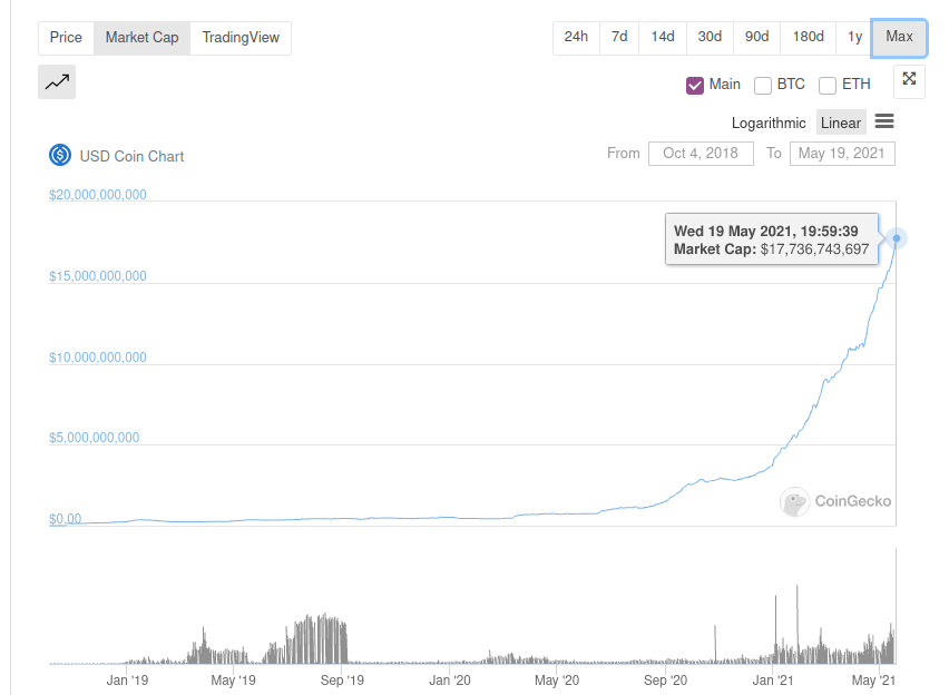
USDC has experienced exponential growth in its market cap the past two years. According to https://www.coingecko.com/en/coins/usd-coin, USDC has a current market cap of $17,772,020,414 as of May 19, 2021.
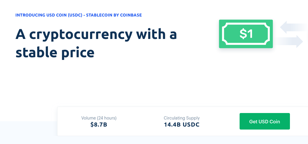
However, Coinbase’s USDC website https://www.coinbase.com/usdc/ lists the current market cap as “only” 14.4 billion dollars.
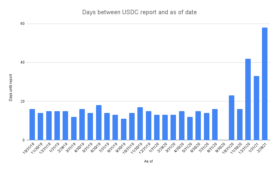
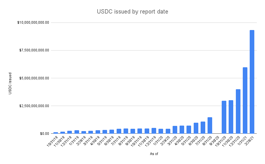
If you look at the data, you will notice a few irregularities. From the first report for October 2018 until August 2020, the reports are always dated ~15 days after the end of the month. The September 2020 report is missing. The transparency page for September links to the October 2020 report. For months following, there are large lags between the end of the month and the date of the reports. The last report available is for February 2021 and it was published 58 days after the end of the month. The March 2021 report has still not been published and March 31 was 59 days ago as of this post. You can see lag in published report date after the end of the month in chart form below.
In the time since September 2020, with little and delayed transparency, USDC has experienced tremendous growth in market cap. According to Coingecko, the current market cap is nearly $18 billion dollars, or nearly double the size since the last attestation report of $9.3 billion dollars for February 2021.
On June 16, 2020, at the request of law enforcement, $100,000 worth of USDC was blacklisted.
The month of the missing report, September 2020, is interesting because the next month’s report for October 2020 is the first report to mention the blacklisted tokens.
So my main questions for Coinbase and Circle are:
What happened to the missing September 2020 attestation report?
Why are there long irregular delays in the release of the attestation reports since September 2020?
When will the March and April 2021 attestation reports be released? Where are they?
Where is the USDC whitepaper?
Is USDC market cap wrong on coinbase.com?
UPDATE: Thanks to the help of @BennettTomlin I’ve tracked down the missing September 2020 report which can be found at the bottom of Circle’s USDC page. Interestingly, Circle’s page is missing the November 2020 report, so you need to also look at Centre’s USDC page to get all the reports combined. I’ve also created a new google sheet with all data to date.
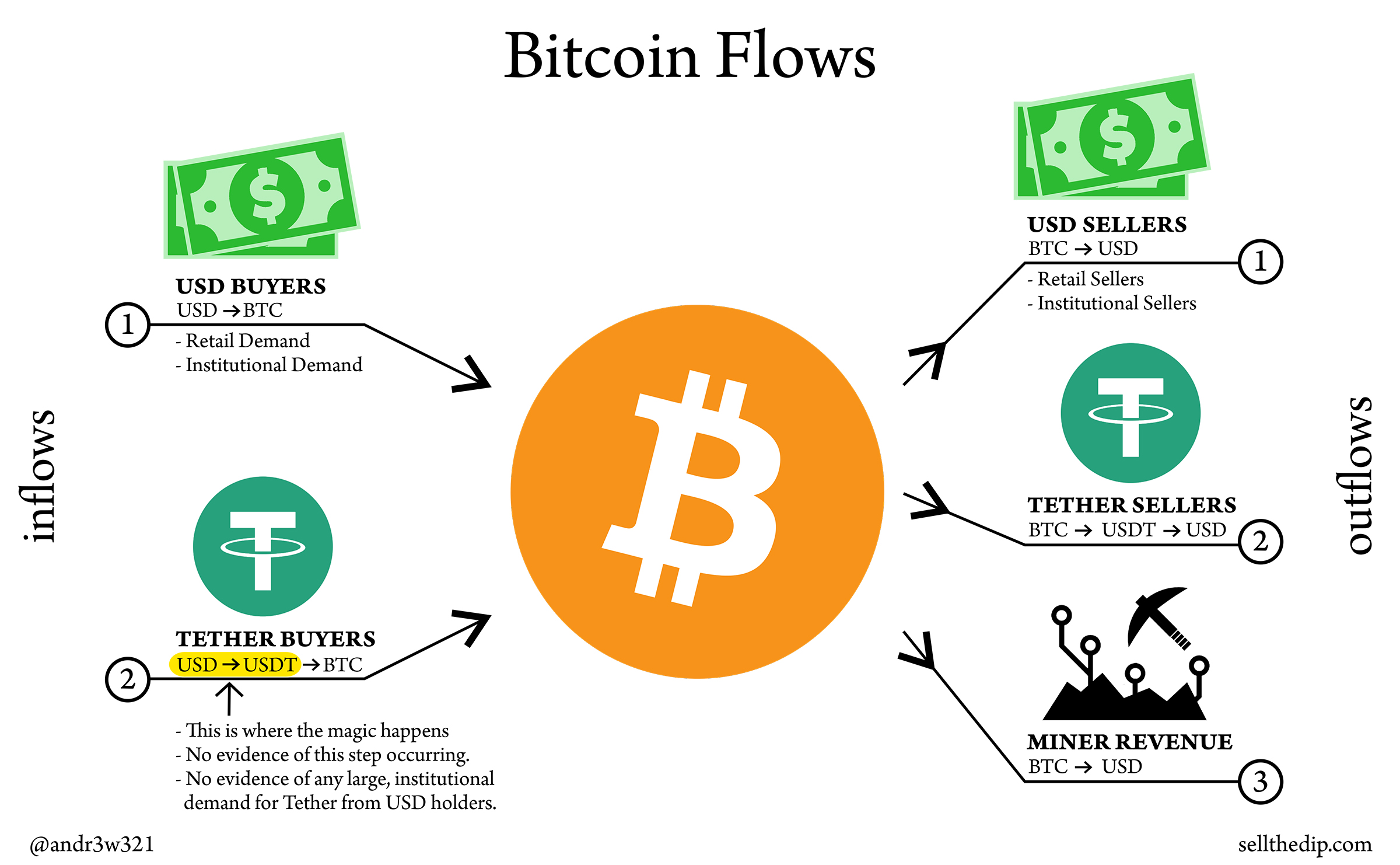
The way I think about whether Bitcoin price is going to rise or fall is by thinking about Bitcoin flows.
Predicting Bitcoin’s price is relatively easy and straightforward if you know the dollar amounts of all the flows at all times.
If Bitcoin inflows > Bitcoin outflows then Bitcoin price will rise to meet demand. If Bitcoin outflows > Bitcoin inflows then Bitcoin price will fall to meet demand.
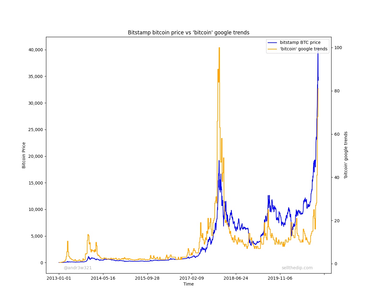
Unfortunately, 1) USD inflows and outflows are impossible to know without getting proprietary exchange data on deposits and withdrawals. The best alternative I’ve found is using something like google trends data to gauge sentiment. When people are googling “bitcoin” a lot, that means there is probably a lot of USD demand for bitcoin at any given time.
Fortunately 2) Tether buyers and sellers and 3) Miner Revenue are known, published values that can be looked up easily. We can use these to create an incomplete, real time model of Bitcoin flows to predict future Bitcoin prices.
Tether buyers and sellers
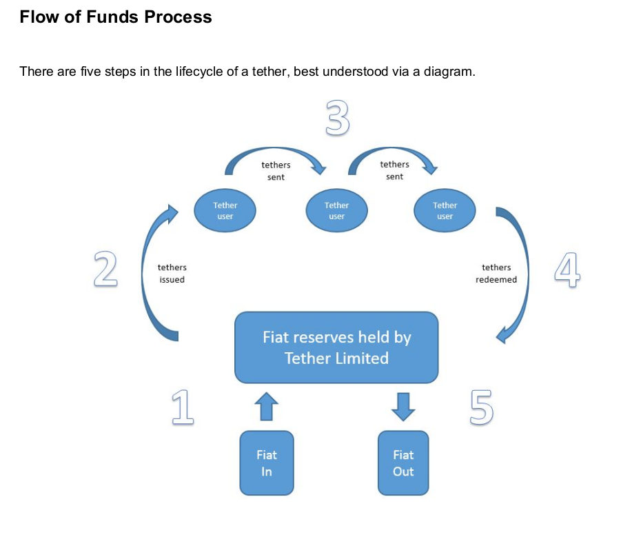
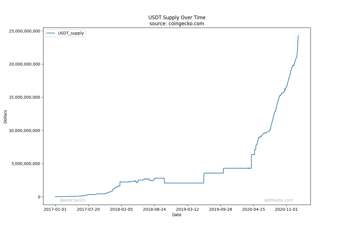
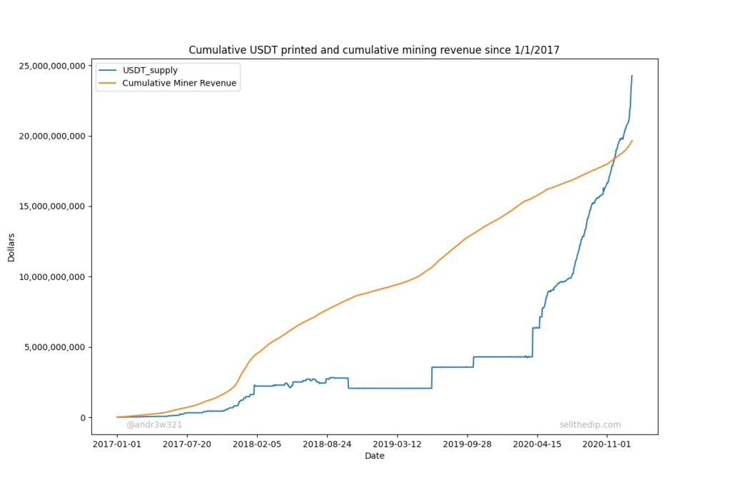
First, we will look at USDT supply changes over time. The way that Tether is supposed to work according to the original Tether white paper is that Tethers are created when people buy USDT with USD and Tethers are destroyed when people redeem USDT for USD. Therefore, the only way for the total supply of USDT to grow is for the amount of USDT buyers to be greater than the amount of USDT sellers.
Source: Tether White Paper
You can easily model Tether flows by looking at the growth or decline in USDT supply over time. When USDT supply is growing that means there are net inflows into Tether, and when USDT supply is declining that means there are net outflows from Tether.
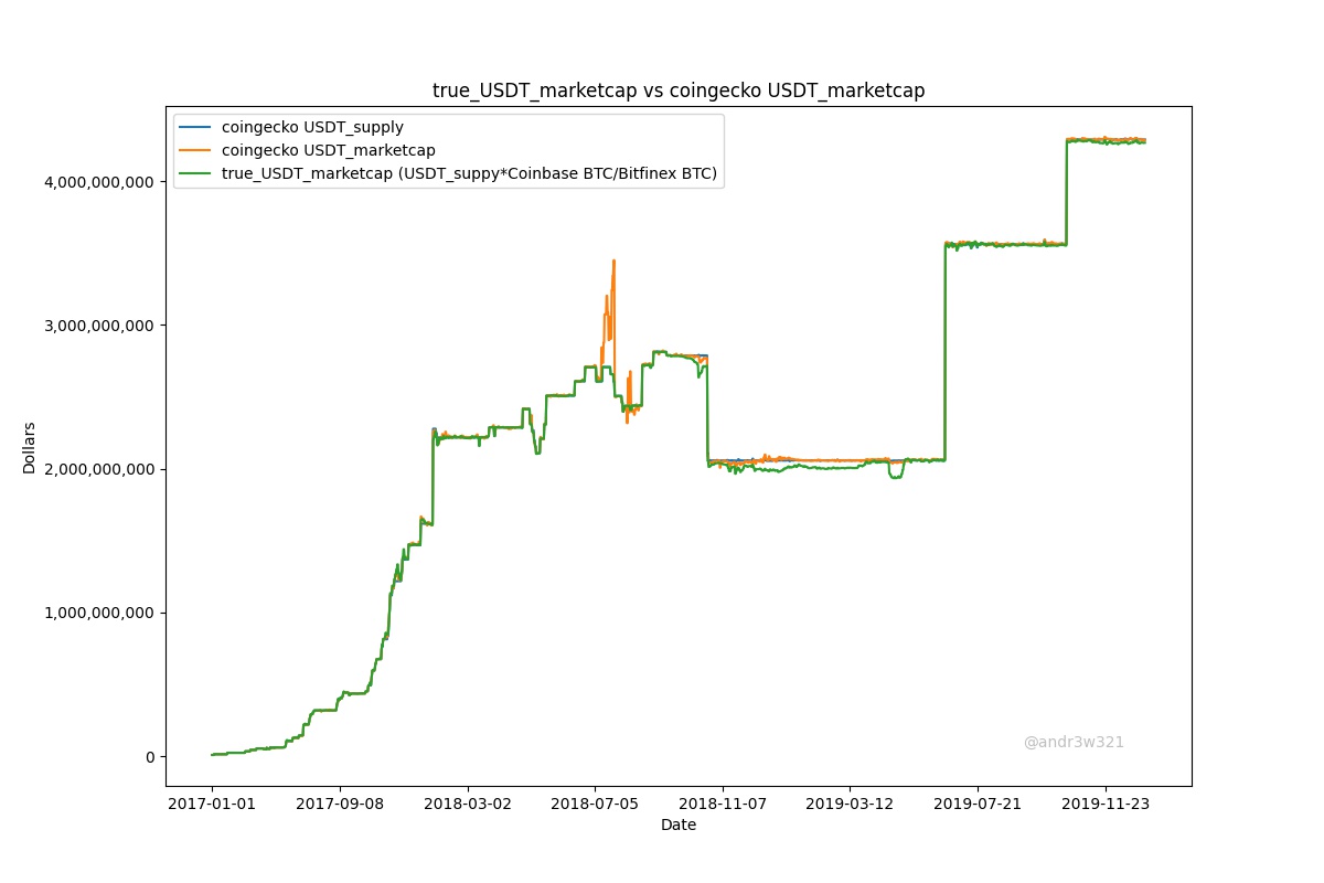
Unfortunately, as far as I know, Coingecko does not provide USDT Supply data directly so I had to indirectly calculate it with USDT market cap / USDT price. As I stated in my last post, their USDT price is calculated in a complicated manner, so it may cause some irregularities in the data. Here is USDT supply over time.
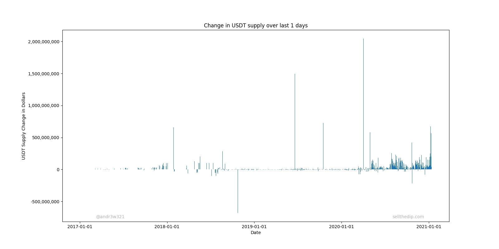
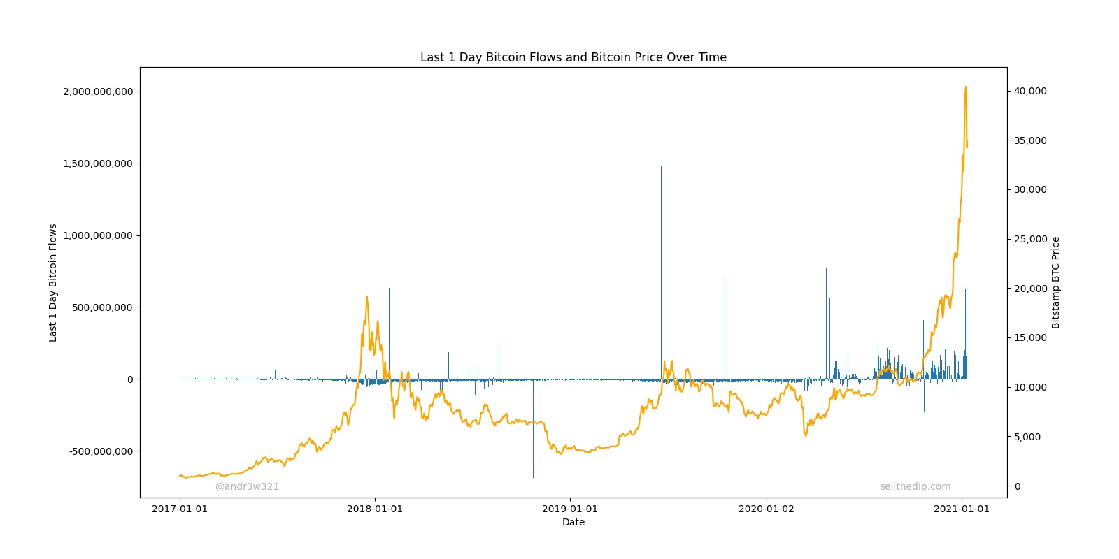
To properly look at flows, you should graph the net increase or decrease over time. You can look at flows on a daily basis with USDT supply – USDT supply 1 day ago:
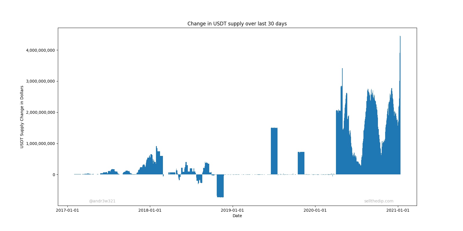
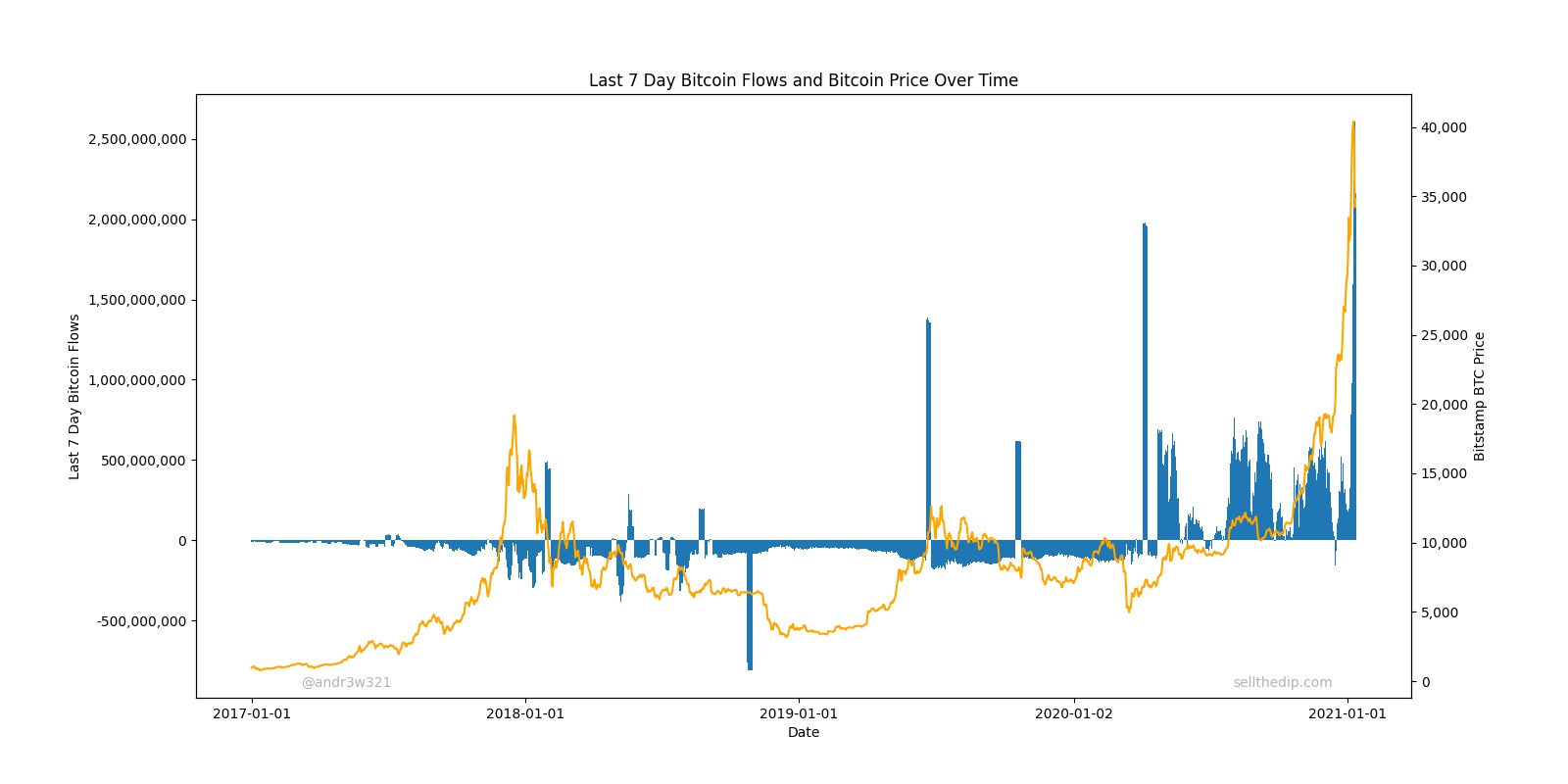
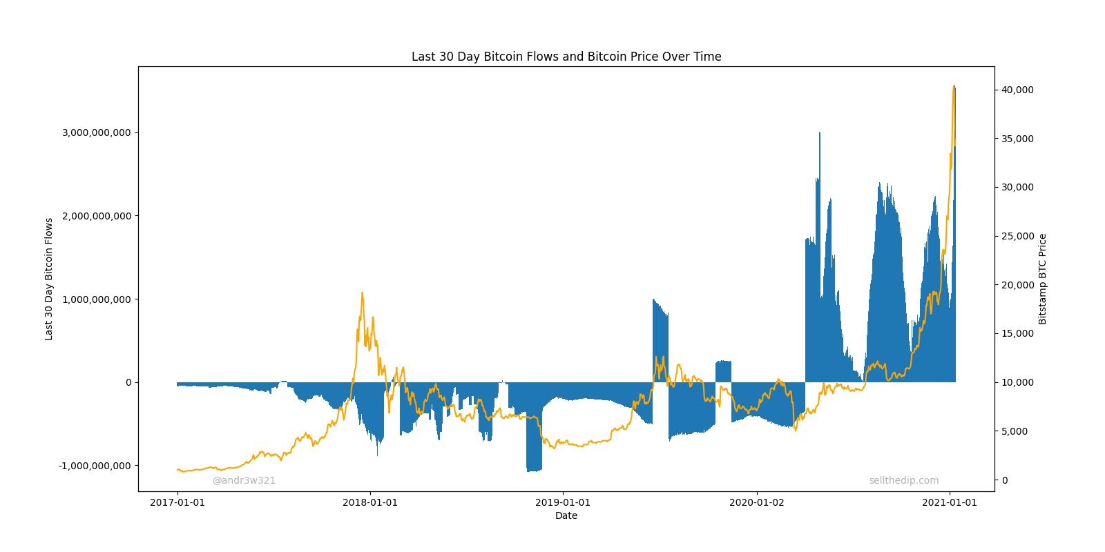
Or you can look at flows on a longer time frame basis. Here is a chart of USDT supply – USDT supply 30 days ago:
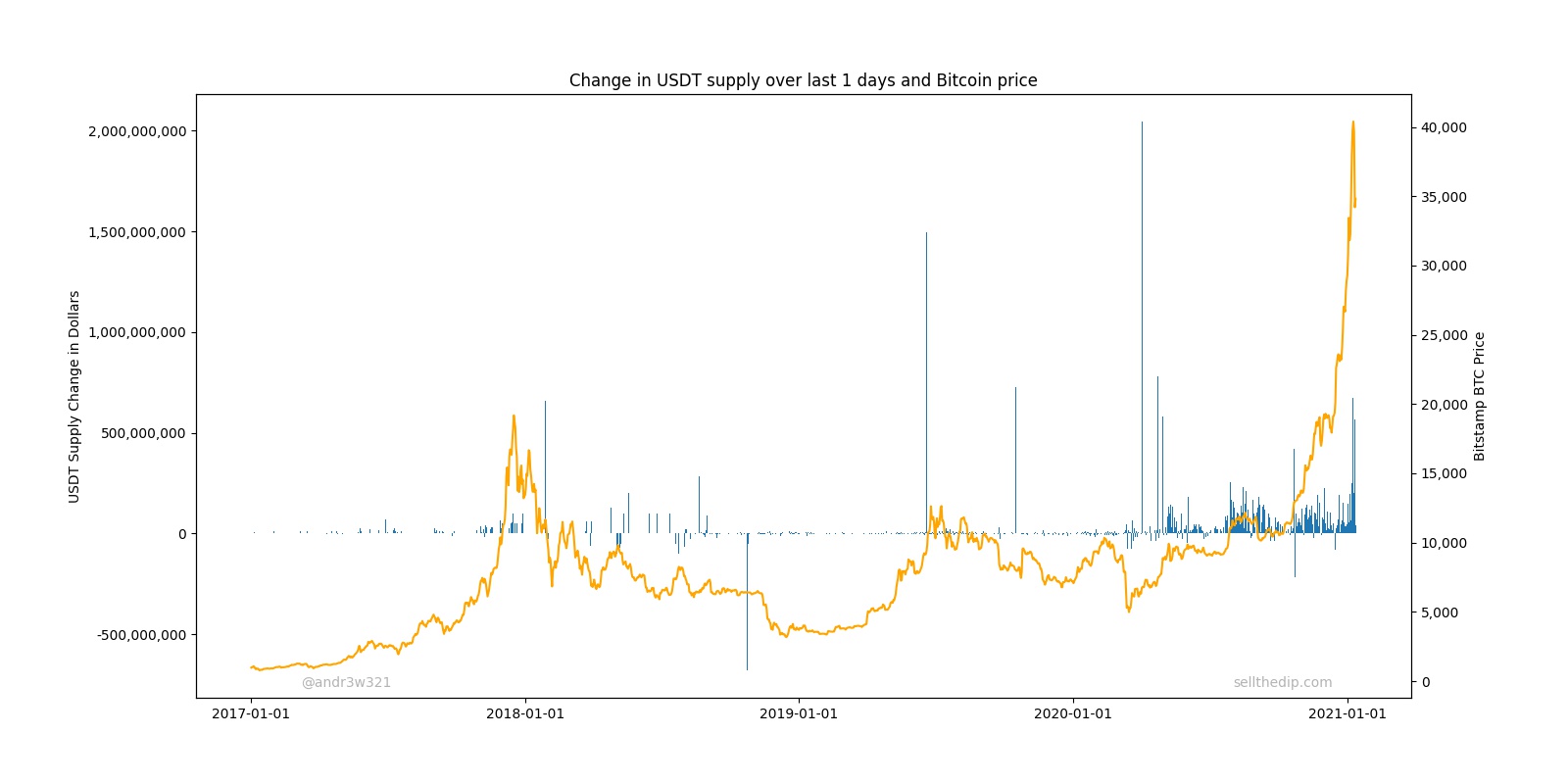
You can then try to predict future Bitcoin prices based on these flows.
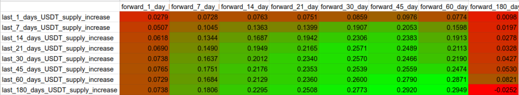
You can clearly see that large USDT supply increases precede several large increases in Bitcoin price and several large USDT supply decreases precede drops in Bitcoin price. Below is a table of Pearson Correlation Coefficients or R values showing change in USDT supply over a period of days vs future Bitcoin returns since 1/1/2018.
You will notice that Tether flows have a low correlation to very short term price predictions, but high correlation to longer term predictions.
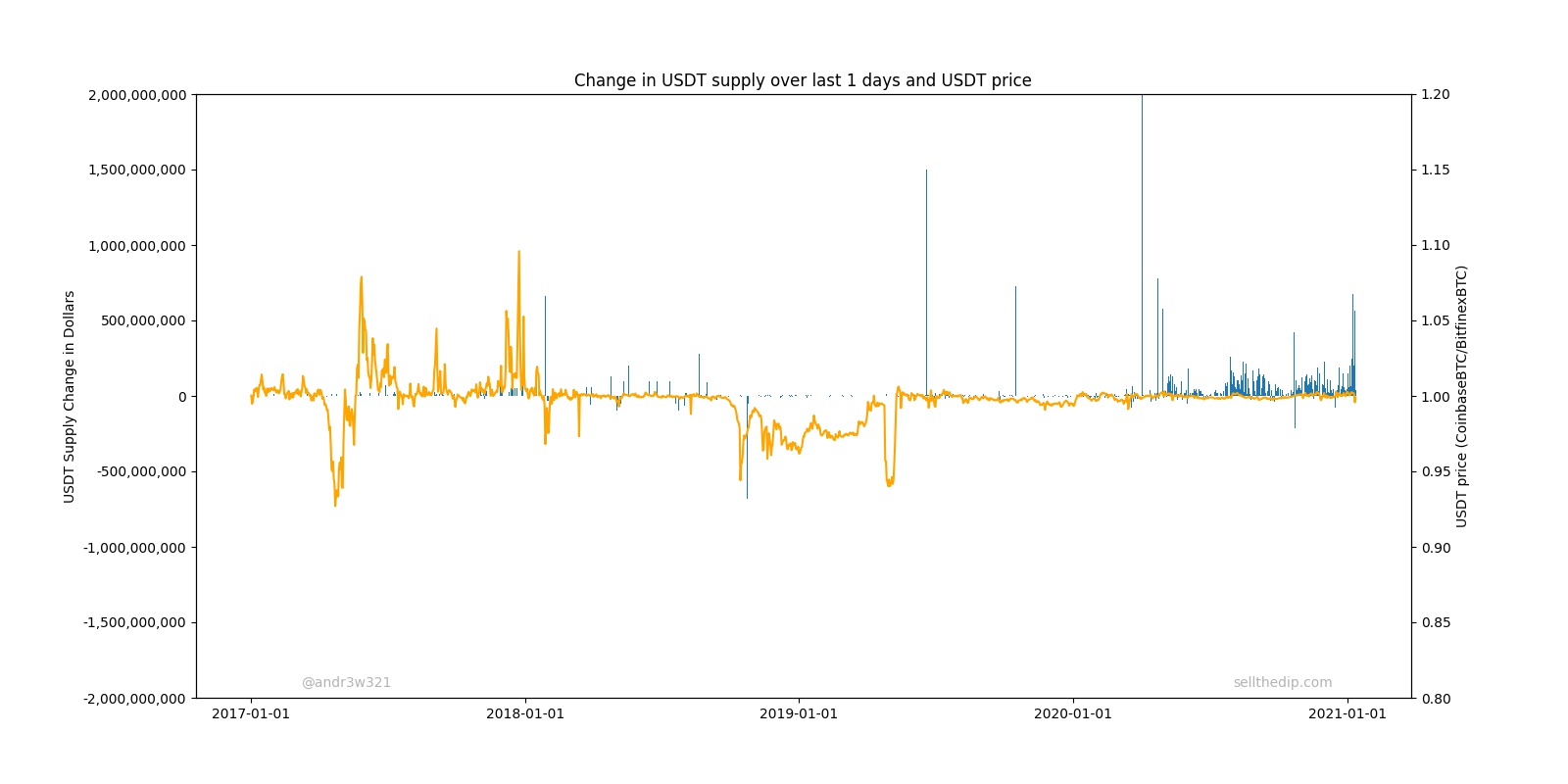
Now that we know that USDT printing is bullish and that USDT destruction is bearish for Bitcoin, it would be nice to know when Tether plans on printing or destroying USDT before it happens. You might think this is completely up to those in charge at Bitfinex, however, they are not immune from market forces. As I mentioned in my last post https://sellthedip.com/a-more-accurate-tether-price-history-chart/ the CoinbaseBTC/BitfinexBTC price is a good proxy for the true price of USDT. When the CoinbaseBTC/BitfinexBTC price is stable and >=1, it is safe to assume they will continue to print and it is bullish for Bitcoin. When the CoinbaseBTC/BitfinexBTC price is <1, it is safe to assume that Tether and Bitfinex will be forced to destroy USDT. This is bearish for Bitcoin. You can see this by charting the daily change in USDT supply vs the USDT price over time.
You can learn a lot from these charts. Sometimes printing too much USDT crashes the price of USDT. Sometimes USDT is destroyed after the price of USDT gets too low. The USDT price dropping below 1 for a sustained period of time (as it did in late 2018) prevents Tether from printing USDT and sometimes even forces Tether to destroy USDT. Destroying USDT has two effects: 1) It reduces the total supply of USDT in an attempt to increase the price of USDT, and 2) It crashes the price of BTC. It’s important to look at the price of USDT over time because it is a leading indicator of USDT being destroyed, which in turn is a leading indicator of Bitcoin crashing.
Miner Revenue
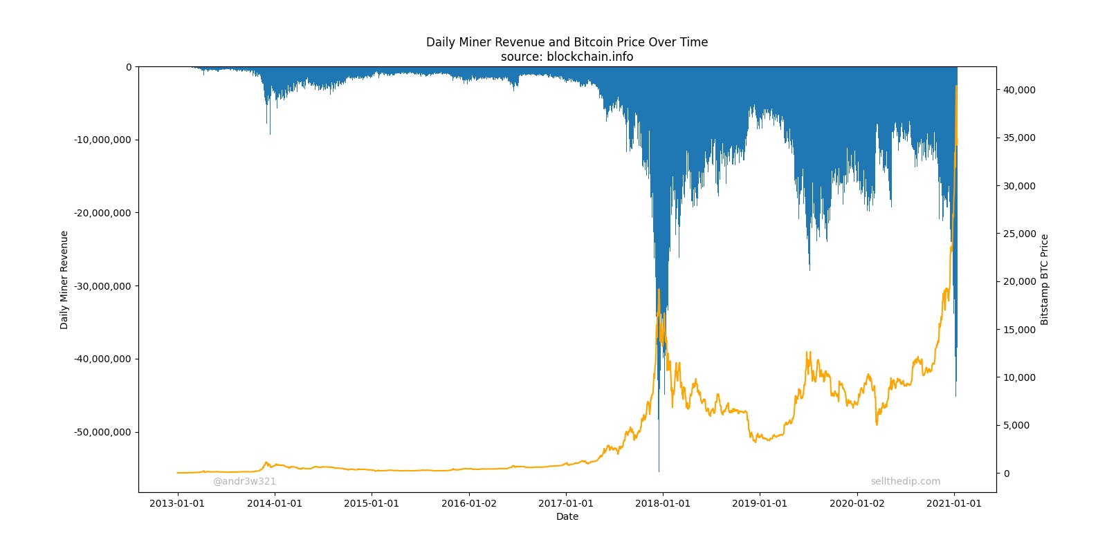
Next, we will look at Bitcoin miner revenue.
Bitcoin miners are net sellers of Bitcoin. They receive their payment in Bitcoin, but they pay their energy bills in fiat. In order to cover their expenses, they have to sell almost all the Bitcoin they receive as revenue for fiat. These miners provide a valuable service to the Bitcoin network by processing transactions and securing the network, but make no mistake about it, the more revenue they receive, the more selling pressure and negative flows it creates for Bitcoin. You can see in the chart that every time there is a large spike in Bitcoin price, Miner Revenue also spikes, and then Bitcoin price declines.
Theoretically, I don’t think Miner Revenue should provide much, if any, predictive power to Bitcoin price anymore than gold miner revenue predicts future gold prices. However, what I believe is currently happening is that enough USDT is being printed to offset what should be very bearish, huge Miner Revenue flows.
This is why exponentially more USDT has to be printed to keep the price of Bitcoin increasing. The higher the price of Bitcoin goes, the higher Miner Revenue goes, and the more Tether needs to be printed to offset those flows.
To finish the incomplete Bitcoin Flows model, you can subtract Miner Revenue from changes in USDT supply over a trailing number of days.
You can see that high Bitcoin Flows are usually lower in bear markets and generally higher in bull markets. You will also no doubt observe that current Bitcoin flows are very high, and this appears to be very bullish. Before you rush to buy Bitcoin on 10x leverage based on my charts, please remember a few things:
First, this model is incomplete because these flows are incomplete. The most important part of Bitcoin flows 1) USD buyers and USD sellers are not included. During early December 2017, there was clearly huge USD buyer demand and very little selling demand. By the end of the month, after prices had peaked, the flows had clearly reversed and there was huge selling pressure at highly elevated prices. What the crowd buys today, they may want to sell tomorrow. A declining ‘bitcoin’ google trends data following a massive spike, such as what we are currently experiencing, is undefeated in predicting a bear market. Ignore it at your own peril.
Second, looking at these flows and getting excited to invest is like looking at past fraudulent accounting statements for a company, seeing how well that stock has performed, and assuming it will continue in this way forever. Eventually, the crash comes and then the regulators step in and shut it down.
Additionally, looking at the Bitcoin flows charts above, take note that there is nothing special about the zero on the y-axis. In a typical day, the USD buying demand is probably higher than USD sellers by several million dollars worldwide which would shift all the flows slightly upward if you were to model USD demand that way.
Bitcoin and the broader market
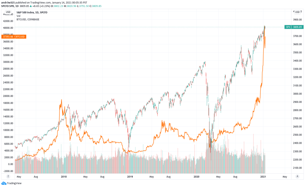
The March 2020 stock market crash showed that Bitcoin is a “risk on” asset. Bitcoin crashed along with almost everything else. With increasing institutional demand comes increased correlation to other risky assets like stocks. Tether can print all they want, but they are not immune from macroeconomic forces. If the stock market crashes again, Bitcoin will certainly tumble with it. From mid February to mid March of 2020 Bitcoin crashed more than 60% from $10,500 to $4,000. Since the market lows, SPY is up ~200% while Bitcoin is up 1,300%. If returns are amplified on the way up, they will be amplified on the way down as well. Investing in Bitcoin at its current price level should provide similar returns as investing in Tesla stock, Apple calls or SPY calls. Conversely, shorting Bitcoin at these levels should provide similar returns as shorting Tesla stock or buying puts on Apple or SPY.
Is Bitcoin headed higher or lower?
I have no idea. Please stop DMing me and asking me. These are the indicators that I look at:
USDT Price or CoinbaseBTC/BitfinexBTC is bullish.
USDT Supply Changes is verybullish.
Miner Revenue is bearish, but more than offset by USDT supply increases.
Google Trends is neutral, but flashing warning signs of going very bearish any day now.
Stocks are bearish and overbought in the short and long term by almost any indicator you look at.
Government regulation is very bearish in the long term. Eventually Tether will get shutdown. I have no idea when.
Overall, I am short term (days to weeks) bullish and long term (weeks to months) bearish on Bitcoin. It is way too early to short. I would wait for the USDT:USD 1:1 peg to break for a sustained period of time which would shutdown the Tether printer. It is also very risky to go long here. There is probably a little upside left in this bubble, but there is tremendous risk to the downside. 50k and 10k price targets are both likely to be hit in the near term. In the longer term, 100k and 5k are both quite possible.
If you found this post helpful, tips are always appreciated, but never expected. Best of luck and happy trading.
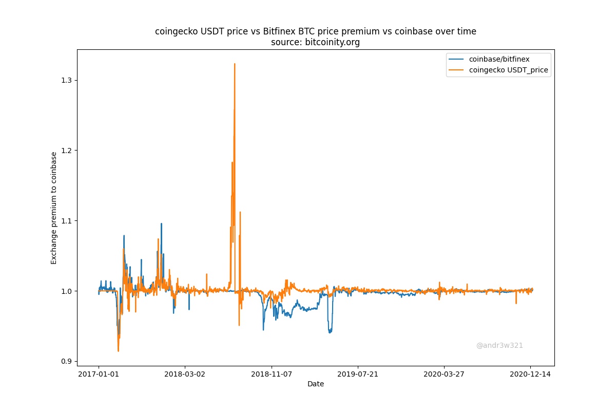
My preferred method of looking at the current or historical Tether price is by looking at the Coinbase BTC price / Bitfinex BTC price. The easiest method I’ve found is by looking at tradingview.com with the ticker COINBASE:BTCUSD/BITFINEX:BTCUSD
Most people look at coinmarketcap.com or coingecko.com for Tether prices, but I don’t think they provide very accurate prices. They both have very complicated methodology for determining coin prices. All prices are 24-hour volume weighted average prices, so the prices listed are actually volume weighted moving averages. Volume weighted moving averages do not provide the most accurate, up-to-date prices. Also, these price aggregator websites do many currency pair conversions to determine prices. This practice is based on some flawed assumptions including the assumption that all US dollar deposits with various exchanges are the same. However, not all US dollar deposits with various exchanges are equivalent to each other. A dollar deposited with Coinbase is not always equivalent to a dollar deposited with Bitfinex. When calculating the price of Bitcoin, these price aggregator websites take an average of the BTC/USD price at various exchanges, but if you try to calculate an average BTC/USD price with
BTC/BitfinexUSD * BTC/CoinbaseUSD / 2 = Wrong average BTC/USD price
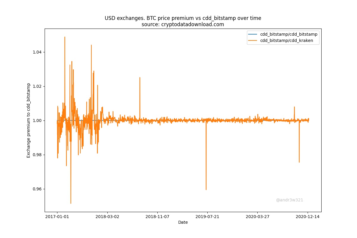
because the denominators (BitfinexUSD and CoinbaseUSD) are frequently worth different USD amounts. 1 CoinbaseUSD is almost always worth 1 USD, but 1 BitfinexUSD is frequently worth significantly less than 1 USD. A more accurate average BTC/USD price could be calculated by only using exchange prices that have extremely high price correlation with each other over time, such as Coinbase, Bitstamp, Gemini and Kraken.
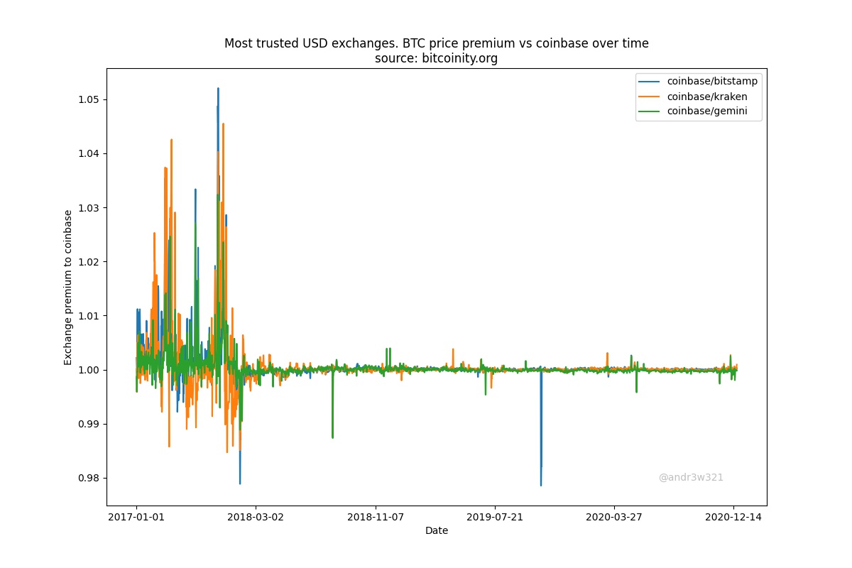
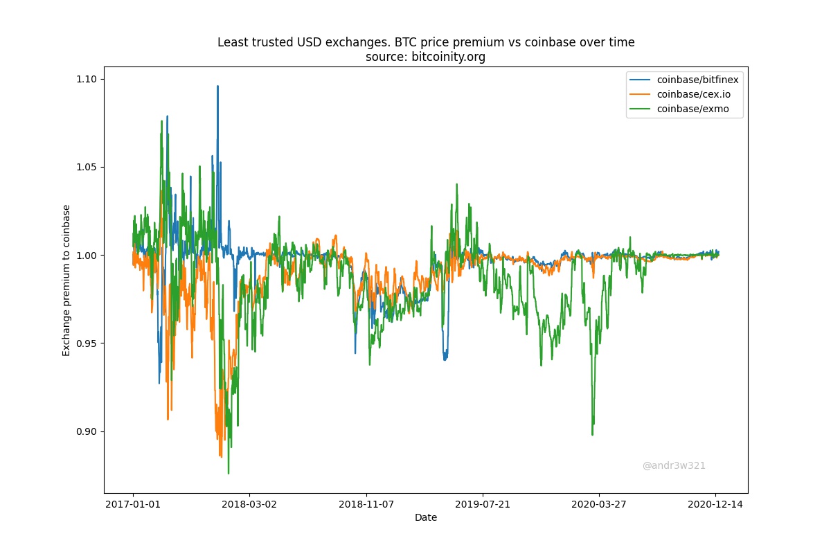
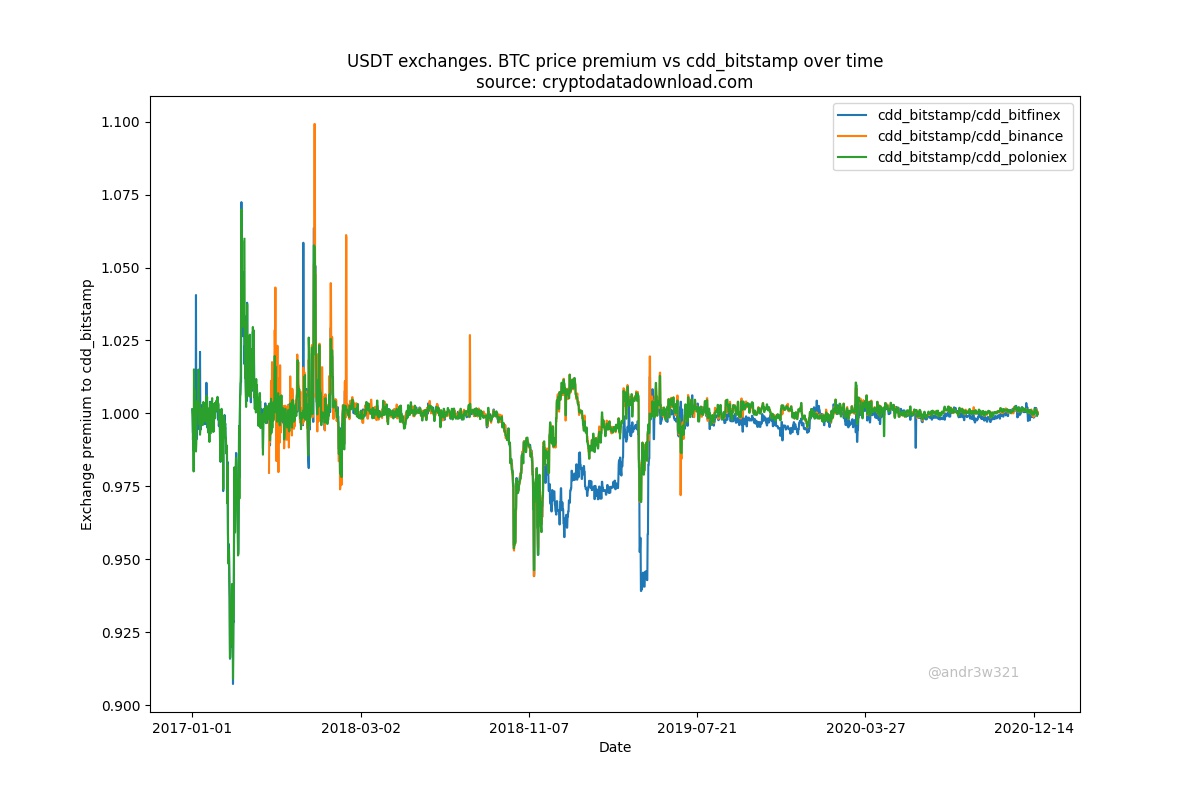
You can chart exchange USD price differences over time by dividing the price of BTC/USD at one exchange vs the BTC/USD price at another exchange. The Bitcoin is always the same (assuming BTC withdrawals and deposits are being processed), so the only difference in value must be due to the difference in USD values. Here is Bitstamp BTC price / various exchange’s BTC price over time. I use Bitstamp for older data and Coinbase for more recent data since Bistamp has been around longer, but Coinbase does more trading volume.
There are essentially two types of exchanges.
Highly trusted USD exchanges that show nearly 100% correlation with each other since March 2018. These include Coinbase, Bistamp, Gemini and Kraken.
2. Less trusted exchanges that have had large BTC price divergences from the most trusted exchanges since March 2018. These are the USDT and Tether dominated exchanges. These include Bitfinex, Cex.io and Exmo.
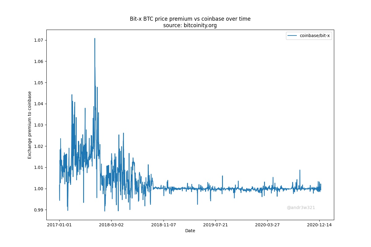
Bit-x is worthy of its own chart. I don’t really know what to make of it since its price action isn’t like any of the others.
Unfortunately, bitcoinity.org doesn’t list any USDT only exchanges so I had to look at another data source: cryptodatadownload.com. Using this data, I found that Bitfinex’s BTC/USD has more in common with the less trusted exchanges that list BTC/USDT than the more trusted BTC/USD exchanges. Binance and Poloniex have no BTC/USD trading pairs, only BTC/USDT.
Below is the data from Cryptodatadownload using source information from the highly trusted BTC/USD exchanges Bitstamp and Kraken. Cryptodatadownload does not have Coinbase data and I found their Gemini data inaccurate.
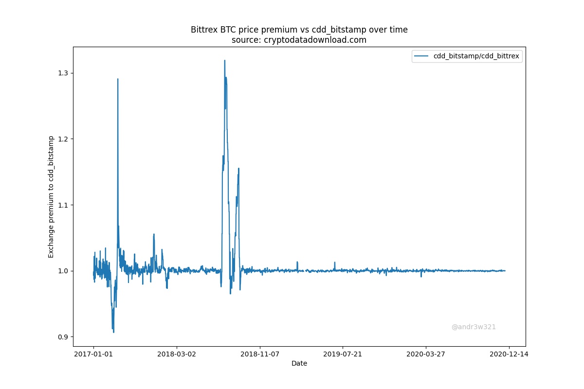
Bittrex is worthy of its own chart as it did not fit well with either the USDT or USD exchanges.
Why should you care about accurate USDT prices? Because you need an accurate USDT price to calculate an accurate USDT market cap. Coingecko and coinmarketcap provide inaccurate USDT prices.
Why should you care about Tether’s market cap? Because Tether’s market cap is highly correlated to and predictive of Bitcoin’s market cap which I will explain further in my next post Will bitcoin go up or down?
Note: I originally published this article on medium on January 30, 2018
I’ve been reading and studying the stock market a lot in the past month and figured I’d share what I’ve learned. There are two main methods of making money in the stock market; passive investing and active investing. In passive investing you make very few purchases and sales of your assets over time, where as with active investing you will move your money in and out of different assets much more frequently.
Passive Investing
The benefit of passive investing is that it takes up very little of your time. The disadvantage to passive investing is that your odds of obtaining above market returns, or alpha, are very low. If your goal is to maximize the total amount of money you earn long term, passive investing makes sense for the vast majority of investors because their time will be better spent earning money at a job or business. This is because:
People lack sufficient capital to invest. An increase in returns on small amount of capital is not worth very much. An extra 1% return on $25,000 invested is only $250/year. There are much easier ways to make an extra $250/year rather than stock picking
People lack the skills to achieve above market returns. You may have a large amount of capital saved but if you don’t know how to invest it wisely you’re much better off investing it passively and letting someone else manage it for you.
Having said that, the only real way to acquire the skills to achieve above market returns is to try it. Some people may enjoy the mental challenge of it even at the expense of potentially lower returns.
What are different ways of passive investing?
Depending on how passive you want to be and how much fees you are willing to spend, the main methods of passive investing in the stock market are going to be:
A predefined asset allocation % which you rebalance every so often. This could be once a year or once a month depending on how passive an investor you want to be.
Index funds
Mutual funds
Hedge funds
Each method has their advantages and disadvantages and will depend on how much control you want over your investments, how passive you want to be, what your risk profile is (what return are you looking for and what drawdown will you tolerate?), and how much in fees you are willing to pay?
A very simple and easy way to passively invest is to buy a low cost ETF like SPY. This is a market weighted index of the top 500 most valuable US companies. The management fees are very low at 0.09% and this is generally the market return baseline to which most investments are measured against.
You can try to pick a mutual fund or hedge fund that will outperform, but what criteria will you use? Why do people even invest in these with the added fees?
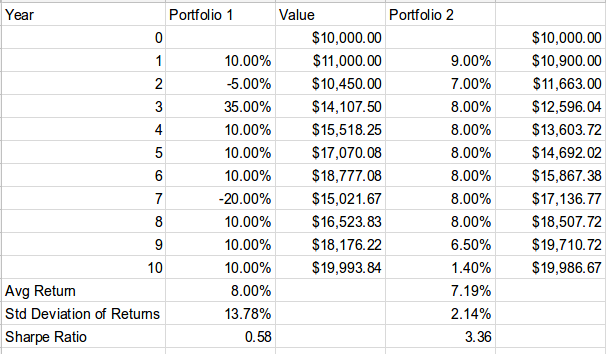
The answer is because of people’s desire to earn excess returns while minimizing their risk. Most people place a higher value on a 100% chance of $500 vs a 50% chance of $1000. Some people may even value a 100% chance of $495 more than a 50% chance at $1000. A way to mathematically represent this concept is with the sharpe ratio = r/s where r = rate of return and s = the standard deviation of the returns. Consider the following portfolio performance comparison:
A lower average return can end up resulting in the same value. The reason for this is the affect of dispersion of returns and the impact of negative returns on compounding interest, explained here. A sharpe ratio is a better judge of an investment’s merit than simply looking at average returns, but can we find a better benchmark for investments?
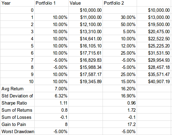
The problem with the sharpe ratio is that it equates volatility with risk. Not all volatility is bad. Upside volatility is very desirable. In Hedge Fund Market Wizards, (highly recommended reading) Jack D. Schwager introduces the “gain to pain ratio” which is calculated as the sum of all the monthly returns divided by the absolute value of the sum of the monthly losses. It can be expressed as gain_to_pain = sum(gains) / abs(sum(losses)) Consider the following portfolio performance comparison:
Which do you prefer? $19,346 or $40,907? Portfolio 1 has a higher sharpe ratio, but it’s ending balance and average return are much lower. If you’re looking for a single number to value and compare investments, the gain to pain ratio is good one. If you’re going to invest in a mutual fund or hedge fund, then I recommend looking for one with a long track record and high gain to pain ratio after accounting for fees.
Diversification and how to avoid blowing up
What about worst draw down percentages? That’s where diversification comes in. Ideally, you want to maximize returns while minimizing volatility, minimizing negative returns and minimizing draw downs. A common question is:
How much should you diversify?
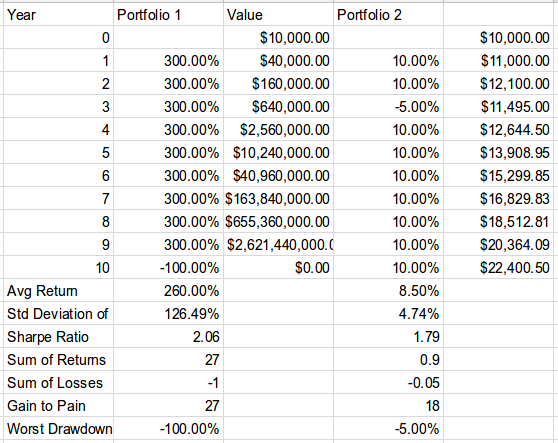
People usually fall into two camps. One is the Warren Buffet camp, “Put all your eggs into one basket and watch it very carefully.” Mark Cuban has been quoted as saying “Diversification is for suckers.” The other camp believes in heavy diversification and owning a broad range of assets with a very small percentage allocated to each one. How much is right for you? The answer depends on the quality of your investment opportunities, your risk tolerance for large draw downs and your future earning potential. Consider the following hypothetical investment opportunities.
1. A stock that is
90% likely to return 300%
10% likely to return -100%
An average return of 260% (0.9×3+0.1×0–1)
or
2. A stock that is
90% likely to return 10%
10% likely to return -5%
An average return of 8.5% (0.9×1.1+0.1×0.95–1)
How much of your portfolio would you allocate to each stock? 260% returns are a lot better than 8.5% so YOLO all in on stock #1, right? Let’s look at a portfolio comparison:
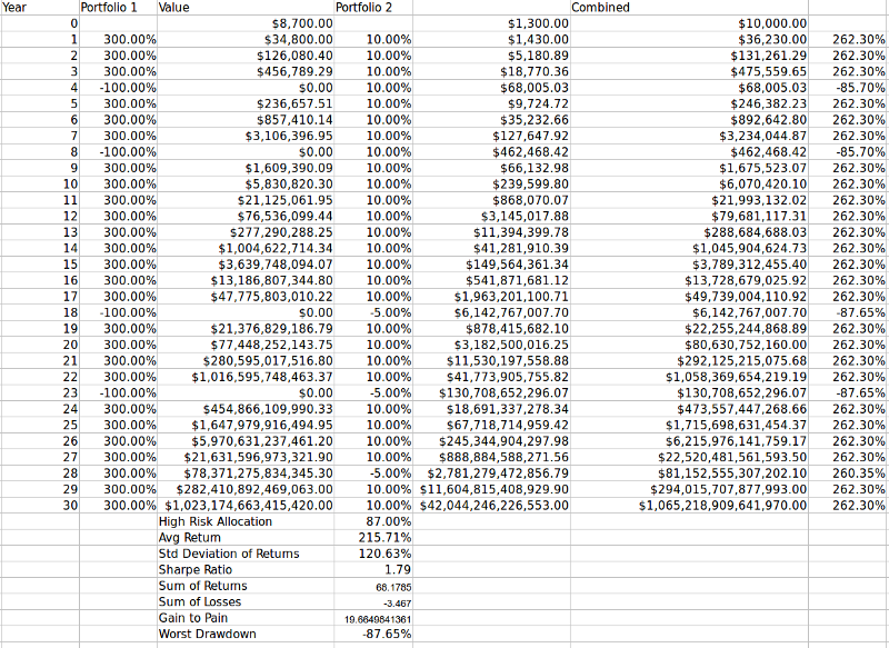
Look, we got up to $2.6 billion by year 9 in portfolio 1! We have a higher average return, sharpe ratio, and gain to pain! Awesome! What about the worst drawdown? Oops! In year 10 we end up with $0. In fact if you keep YOLO’ing all in on the risky stock, it is a statistical certainty you will end up with $0. The answer to the problem of how best to allocate capital can be solved mathematically using the kelly criterion for simultaneous bets, assuming that all you care about is maximizing your long term median ending portfolio. The more outcomes you add, the more complicated the match becomes. For a simple rough calculation we can use the normal kelly criterioncalculator to see that we should be wagering 87% on the risky stock. Let’s run a monte carlo sim on 30 years to see how that goes:
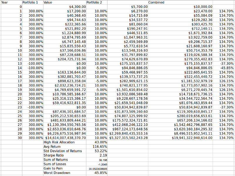
After 30 years in the combined portfolio we end up with an ungodly amount of money that I don’t even know how to pronounce and we’re maximizing our capital growth rate. All good right? Well… sort of. Suppose we’re managing outside capital. How do you think an investor is going to feel if he invests in year 3 and loses 86% of his money in the next 12 months? He’s going to pull his investment and you may be out of job. There’s also the potential problem of overestimating your odds which can be devastating when betting full kelly as it increases your volatility and reduces your returns possibly even into the negative. This is not the case with 1/2 or 1/4 kelly as long as the overestimation is not too large. Let’s have a look at 1/2 kelly criterion:
This is more reasonable with a realized worst drawdown of 46%, but that may still be too steep for some investors so you may consider 1/4 kelly. This exercise demonstrates the importance of asset allocation and sizing. It’s often prudent to sacrifice returns in exchange for lower maximum drawdowns via diversification.
Great, so we’ll diversify and spread our investment into several of our most promising assets. As long as we spread our risk around a bit we’ll never go broke or have a devastating loss. How about Bitcoin and Ethereum? Facebook and Google? How about 100 different mortgage backed securities? As long as we diversify into multiple assets our chance of losing a large portion of our investment is very small, right? Not so fast. What all of these portfolios suffer from is multicollinearity, which is just a fancy way of saying that while it may seem you are diversified with a collection of assets, you’re not really if there is a single event which could cause all of your assets to drop in value at once. If there is even a 1% chance that an event could happen that would cause your whole portfolio to blow up, it’s too high. Given enough time, it’s a statistical certainty this will happen and you will lose it all.
Multicollinearity is the reason so many people predicted the Trump election incorrectly. Polling across different states are not independent events. It’s the same reason Long Term Capital Management went bankrupt. It’s the same reason large mortgage backed securities were bundled together and rated AAA investments. It’s the same reason portfolio insurance caused a crash in 1987. It’s the same reason sportsbooks won’t let you parlay the favorite and the over. Failure to understand this concept is a source of great losses and potential for great profits if you find the right opportunities on Wall Street. Any time there is a basket of supposedly uncorrelated assets and a derivative is being dealt on this basket, there is potential for profit.
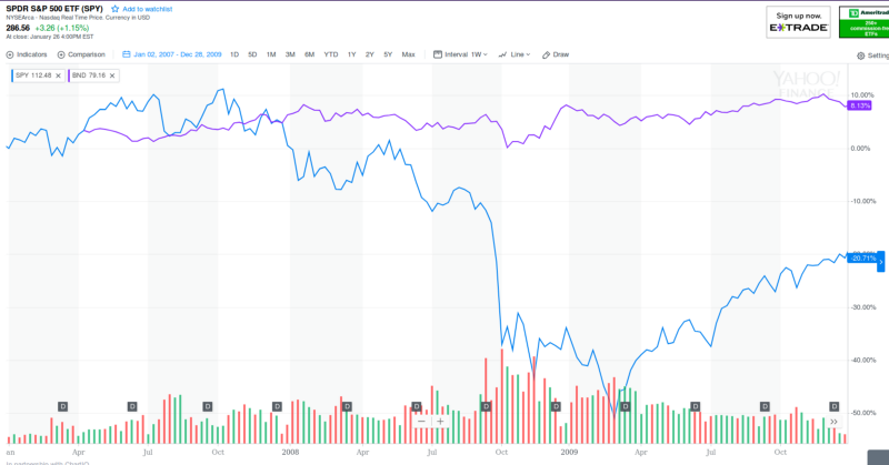
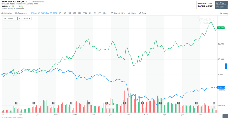
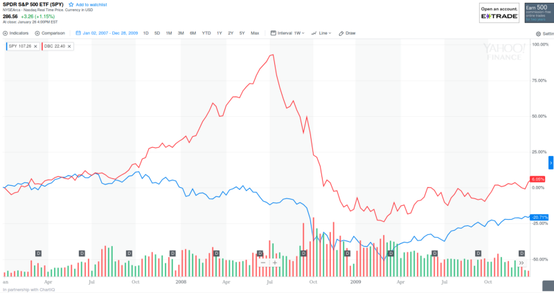
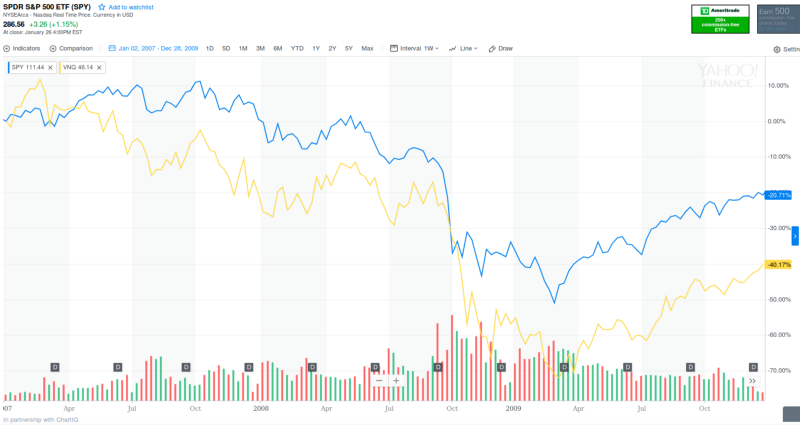
True diversification requires uncorrelated assets. While holding a collection of stocks is a diversified collection of stocks, it’s not a diversified portfolio. All stocks will go down in a bear market. For true diversification you need to hold assets that will go up in a bear market. This mostly includes gold, commodities, bonds and cash. Another way to make money in a bear market is by shorting stocks. Let’s look at the performance of these assets over the great recession of 2008.
Being long bonds, long gold, long commodities or short real estate would have been great investments in 2007. Later, I’ll talk about a few indicators you may use to predict when to allocate a larger percentage of your portfolio to these assets. If you don’t believe in market timing, holding a fixed percentage of these stock alternative assets and rebalancing once a year can greatly decrease your max draw downs and potentially increase returns.
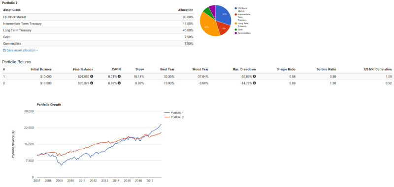
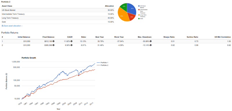
I hope by now you understand that even though stocks are the highest returning passive investment asset class, holding 100% of them long in your portfolio is not optimal. Don’t take my word for it though, play around and backtest portfolios. Try adding a small amount of commodities or bonds or gold to your portfolio and see what happens. Taken to the extreme of favoring low volatile consistent returns over high volatile erratic returns, Tony Robbins (inspired by Ray Dalio) introduced an All Weather Portfolio that consists of:
30% US stocks
40% in Long-term U.S. Treasury Bonds
15% in Intermediate-Term U.S. Treasury Bonds
7.50% in Gold
7.50% in broad Commodity basket
This seems absurdly conservative, but the results of the backtest are interesting.
Substituting gold for commodities since commodities pricing on portfoliovisuzlizer.com only goes back 10 years.
As you can see the total return is lower but the sharpe ratio is higher. This portfolio has a worst drawdown of only 4% vs a 51% worse drawdown for the all stock portfolio. It’s not a portfolio I would recommend for young people or those who can stomach large losses and stay invested, but if you want to sleep easy at night, are near retirement, or manage the largest hedge fund in the world (as Ray Dalio did) than this allocation can make sense. It also highlights the value of diversification.
Passive ways to stock pick
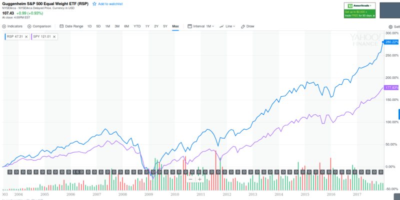
Beyond diversification how else can we improve our portfolio? How can we beat the S&P 500 ETF SPY for our stock allocation? One way is with equal weighted index funds. The problem with SPY is it is market capitalization weighted. This means you are allocating a larger percentage of your portfolio to stocks that go up in price. This essentially ensures you are holding overpriced stocks as a disproportionate part of your portfolio. This is the exact opposite of what you should be doing. There are infinite alternative and better ways to decide your stock allocation via equal weighting, PE ratios, revenue etc. A dead simple passive method is to hold RSP an equal weighted S&P 500 ETF. The management fee is extremely small at 0.4% and it has beaten SPY since its inception in 2003:
Another method of generating alpha is to buy small market cap stocks. The S&P 500 is full of large companies that don’t have much room for further growth. It’s much harder to grow revenues at a big business than at a small business. Small cap stocks have consistently over performed.
Determine company’s return on capital = EBIT / (net fixed assets + working capital).
Rank all companies above chosen market capitalization by highest earnings yield and highest return on capital (ranked as percentages).
Invest in 20–30 highest ranked companies, accumulating 2–3 positions per month over a 12-month period.
Re-balance portfolio once per year, selling losers one week before the year-mark and winners one week after the year mark.
Continue over a long-term (5–10+ year) period.
Active Investing
If you’re not sold on passive investing and want to take a more involved role in your investment, then this section is for you. The benefit of active investing is the potential to earn above market returns. The disadvantage of active investing is that it is time consuming. If you would like to actively invest you will need both a large amount of capital and the skills to invest wisely. Lacking either of these you need to go out and either earn more capital or increase your investing skills (read books, find a mentor, get experience with a job in finance, etc). There are near infinite ways to make money in the stock market. There are so many things you can bet on: company earnings, the broader economy, future interest rates, currency exchange rates, weather, etc. There are so many ways to bet: stocks, bonds, futures, options, etc. There are so many different time horizons to hold for: milliseconds, seconds, hours, days, months, years. You will have to narrow your focus for what works for you. In general as a small time investor you will have a much better chance at generating alpha on smaller market cap, lower liquidity assets with long time horizons. The hedge fund managers who manage billions of dollars are mostly involved in large market cap, highly liquid investments with short time horizons. It’s definitely possible to compete and win at that game, but your odds of success will be lower.
1) Searching for investments
Like any business you need deal flow. The idea is to start with all the bets available that you can make and narrow them down step by step to the best ones. The general process will be:
Look at various investment opportunities.
Pick the best ones and invest.
Wait for investment to payoff or fail to payoff and realize profits or losses.
Learn and improve after seeing results in step 3. Hopefully you’ll be better at step 2 in the future. Go to step 1.
Different ways of generating deal flow might be:
Reading investment news and discussion: WSJ, Barrons, Financial Times, Seeking Alpha, CNBC, investment newsletters, investing forums, financial twitter, mergers and acquisitions, IPOs, etc.
Search for fads. This is the whole premise of Laughing at Wall Street. Chris Camillo looks for information that most stock analysts are not looking at — Michelle Obama buying JCrew (buy $JCG), Trump tweeting (buy $TWTR), people on reddit complaining they can’t find Nintendo Switches to buy because they’re all sold out and there are shortages (buy $NTDOY). He then buys long term in the money call options, six months to a year out, long enough for his investment premise to be realized in revenues by the market and hopefully profits. He doesn’t read financial statements at all.
Use a stock screener. I like https://finviz.com/. You can search for companies with good (or bad if you want to short) fundamentals such as low P/E ratios or low Book/Value. If you prefer technical analysis indicators, then you can search for stocks with a low RSI, or a 20 day moving average above the 200 day moving average, or stocks with unusually high volume lately, etc. https://www.youtube.com/watch?v=C2rptGOMJcg provides a good demo.
Once you have a method of generating deal flow, you need to further refine your search. As Warren Buffett says, “You don’t have to swing at everything — you can wait for your pitch.” You need a way of figuring out which pitches to swing at. To be perfectly clear, when you’re active investing you’re trying to predict future asset prices. In order to do this you’re going to need to find predictive indicators to predict future prices. This may involve doing fundamental research on a company’s financial statements, looking at a price action pattern that you’ve back tested, or it may be as simple as looking up a futures price and using that as your prediction for an arbitrage trade. There are two main methods of stock picking and narrowing your search; top down investing and bottom up investing.
Top down investing
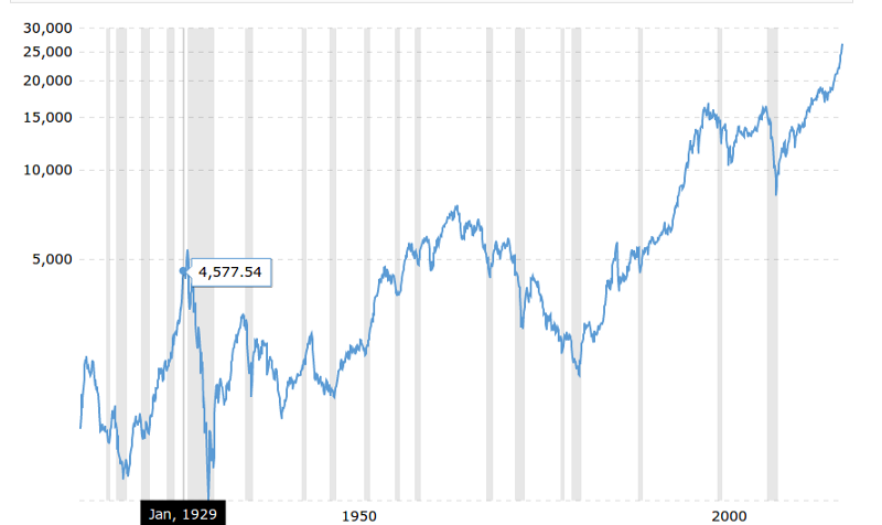
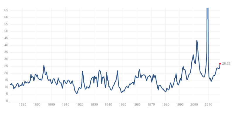
Top down investing starts by making a prediction about the direction of the stock market and economy as a whole in order to begin narrowing your search down to which sectors you think will perform best. For top down investing, let’s first take a look at what we’re trying to predict — the prices of broad stock market indexes:
Recessions are shaded in gray. The fact that this chart is inflation adjusted is very important. Stocks don’t appreciate much in real value in times of extremely low inflation (deflation in the 1930s) or in times of extremely high inflation (1965–1982), although they will still hold their value better than holding cash would.
History is a great teacher. Everything that will happen in the future of the stock market has already happened in some form in the past. I would highly recommend reading about at least the last 100 years of recessions here: https://en.wikipedia.org/wiki/List_of_recessions_in_the_United_States.
The Federal Reserve
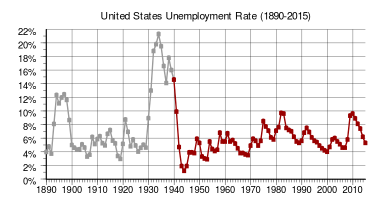
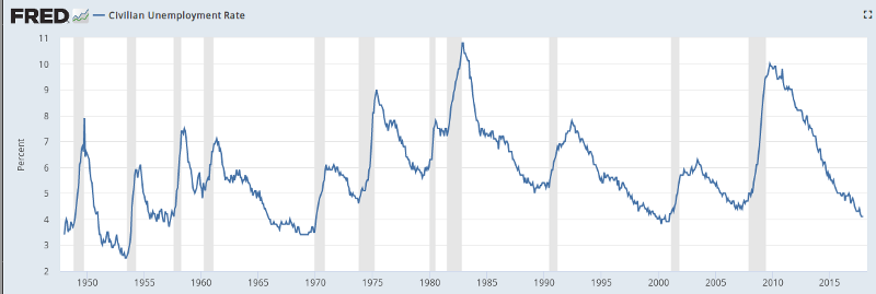
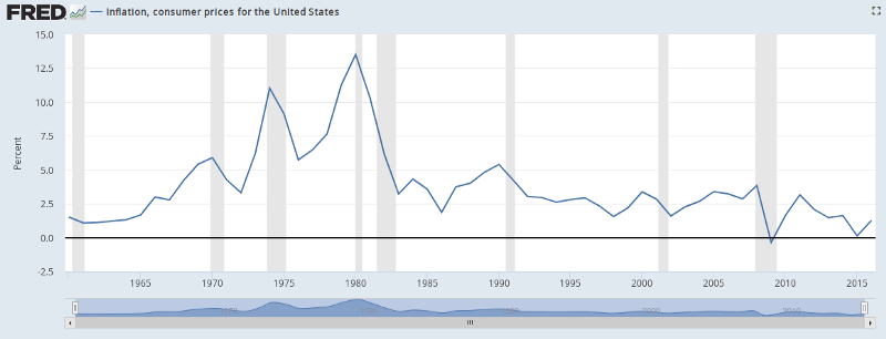
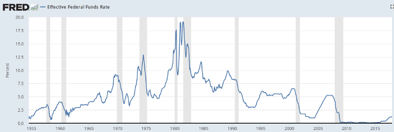
The single most influential entity on the direction of the stock market going forward is the Federal Reserve’s monetary policy. The Federal Reserve’s stated goals are to maximize sustainable employment, maintain stable prices, and moderate long-term interest rates. In order to predict what the Federal Reserve’s monetary policy will be going forward it’s best to look at the same data they’ll be looking at to guide their policy: unemployment rates, inflation rates and long term interest rates.
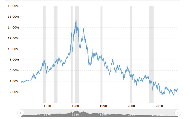
Quality FRED data only goes back to ~1960 for inflation rates.
Looking over the inflation rates you will notice the negative inflation (deflation) rates during the great depression which ultimately led Franklin D. Roosevelt to pass the Gold Reserve Act of 1934 which devalued the US dollar and ultimately led to higher inflation, lower unemployment and a growing economy.
You may also notice the great inflation from 1965–1982. This was largely a result of the Federal Reserve’s monetary policy of keeping lending rates too low for too long. They were trying to keep unemployment numbers down and they did for awhile, but they ignored the growing inflation rates which ultimately led to high unemployment numbers and a recession — exactly what they were trying to avoid. Richard Nixon was running for reelection in 1972 and pressured the FED to keep interest rates too low for too long, resulting in worse short term inflation: https://www.investopedia.com/articles/economics/09/1970s-great-inflation.asp.
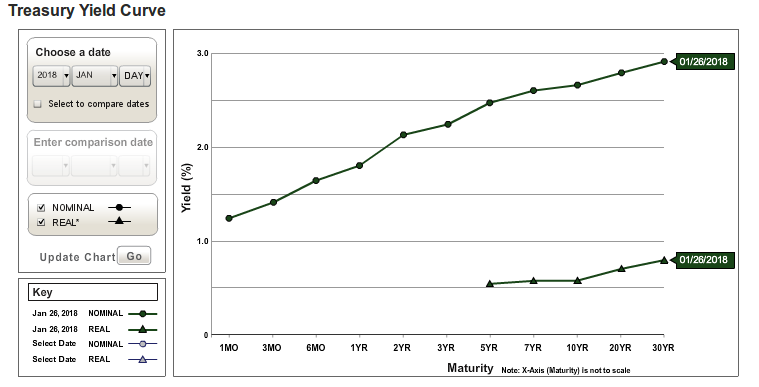
Below is the current January 2018 yield curve. This is its most common state. It’s natural for investors to demand higher interest rates for long term investments than short term investments.
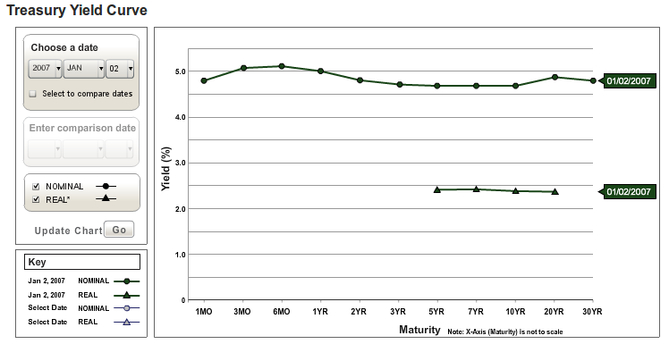
January 2007 yield curve prior to the great recession:
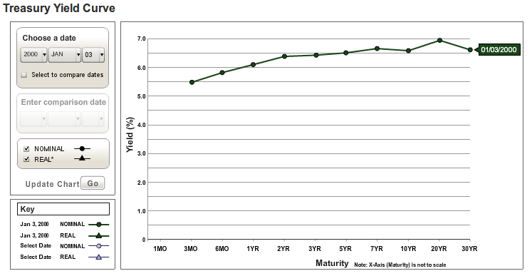
January 2000 yield curve prior to the dotcom crash:
Why does the yield curve flatten? It’s part of the natural business cycle. The typical cycle looks like this:
The economy goes into recession.
The FED lowers the federal funds rate.
The economy starts to recover.
Inflation rate increases.
The FED increases the federal funds rate.
Go to step 1.
Non predictive indicators
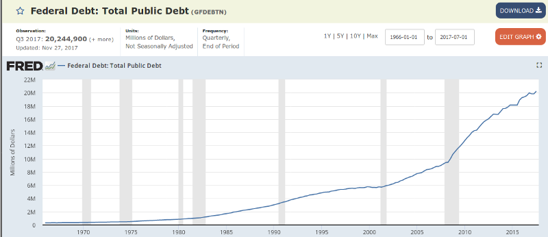
I’m sure you’ve read a few zerohedge headlines over the past five years about how the market is due for another great depression and the US has crippling debt. This chart looks scary right?
Total Public Debt
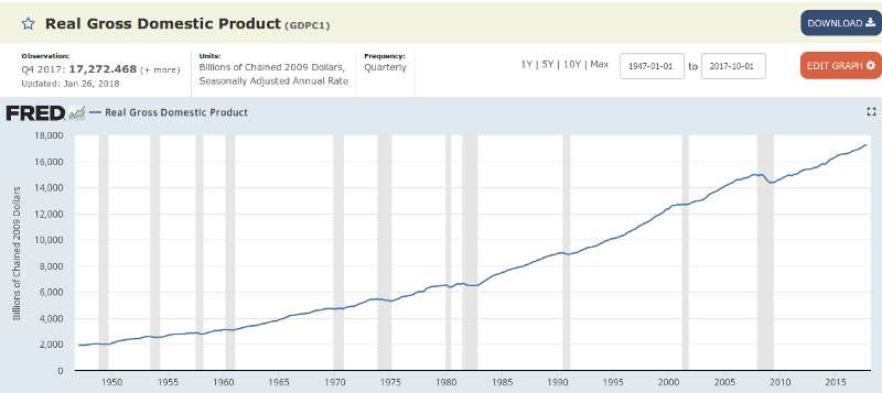
This chart is only half the story. Let’s look at real GDP:
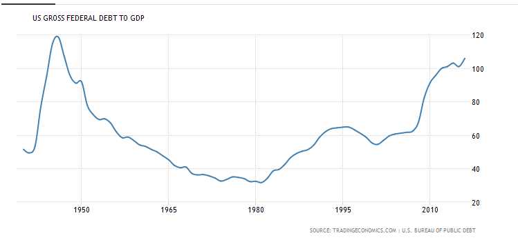
A more reasonable statistic to use is to combine the two by looking at the debt to GDP ratio.
While the total debt is certainly high so are productivity and household income. As you can see, we had similar debt levels in the 1940s during WWII and we did not have a giant depression that followed. Also, when the same country is both the debtor nation and the currency issuer of that debt,said country can print money and inflate away a lot of its debt. As long as investors keep buying US treasuries and using the US dollar as the world’s reserve currency, interest rates (yields) will stay low and so will US debt payments as a percentage of tax revenues. The main takeaway is that you have to look at the whole picture — both debt and income. As incomes rise, it’s natural for debt levels to rise with them.
Another false indicator people like to point to are P/E ratios.
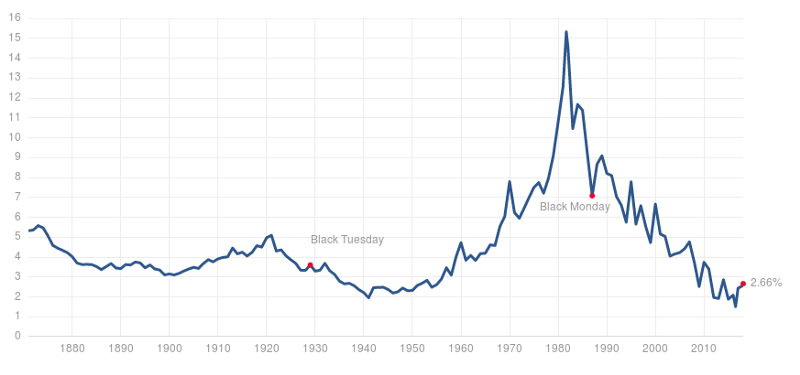
Stocks look pretty expensive right? Check out this article https://seekingalpha.com/article/3991102-view-top-historical-p-e-ratios-market-peaks for further explanation. The problem with using P/E ratios alone as a predictor is they don’t take 10 year US treasury rates, also known as the risk free rate of return into account. Stocks are going to appear expensive when the alternative is earning 2% risk free return on your money. Also, stocks will look cheap when the alternative is earning 16% risk free return on your money. You need to combine P/E ratios and 10 year treasury rates to truly determine when stocks are expensive because context matters. Have another look at 10 year treasury rates.
Bond yields and stock yields are typically inversely correlated and generally the Federal Reserve’s federal funds rate will determine the bond yields. As long as the Federal Reserve maintains low interest rates, treasury rates will stay low, bond prices will stay expensive, and stock prices will continue to rise. This will eventually cause a rise in inflation which will likely cause the Federal Reserve to increase the federal funds rate, which will then cause treasury rates to rise and bond prices to become cheap, which will then cause money to move out of stocks and into the cheaply priced bonds, which will then cause a stock market correction. This is the natural business cycle discussed above.
The stock market being at an all time high
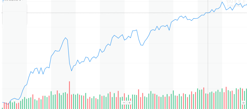
All time highs in the stock market are perfectly normal. It’s natural for the stock market to go up over time and to be constantly making new all time highs. The S&P 500 has spent about ~1/3 of its time within 5% of an all time high. Would you invest at the end of this bull run?
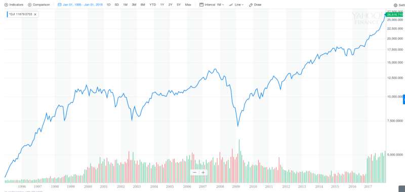
The above is the Dow Jones Industrial Average from 1986–1995. The following chart depicts what happened next.
Just because the market is going up and is at an all time high does not mean it is due for a crash or that it’s a bubble and is way overvalued.
Bottom up investing
Bottom up investing ignores the broader sector and economic conditions and selects investments mainly on the merits of the individual stock.
For individual stocks, most predictive indicators are either a result of technical analysis or fundamental analysis.
Technical Analysis
The main methods of technical analysis are:
Trend following revolves around recognizing whether a trend is up or down and then buying on the way up and selling on the way down. Ideally you would buy when the long term trend is up, but the stock is short term oversold. You would then sell on the way down when the long term trend is down, but the short term is overbought.
Mean reversion revolves around the theory that prices randomly fluctuate around the average. The idea is to sell when the price is above the mean and buy when it is below. An example might be trading the CBOE Volatility Index VIX around it’s historic mean. Another might be tracking the correlation of an index fund ETF to various stocks and buying the stocks and shorting the ETF when correlation is below its historic mean.
Pattern recognition revolves around finding price patterns that predict future prices. An example might be the day trading gap and go strategy, looking at seasonal/day of the week/day of the month/time of the day price patterns, or training a machine learning algorithm on historical price and volume data.
Fundamental Analysis
For an introduction to fundamental analysis I highly recommend this 42 part Buffet Books Youtube course https://www.youtube.com/playlist?list=PLCFs7WmLhCvwRHhZNYT-ZGwqWnOIjMB10. I spent ~two days watching them and taking notes and it gave me a very solid foundation for how to value a stock.
3) Making an investment
Once you’ve narrowed down your investments into your best ideas you’ll need to execute the trade. You can do all the right research and make all the correct predictions, but if you don’t implement your trade correctly you can still lose money. Let’s look at various trading strategies.
Hedging
As an event driven trade example, WYNN dropped 10% this past Friday from $199 to $180 on news of sexual allegations against Steve Wynn. This is a very large short term move for a stock. Suppose you hypothesize that the market has overreacted to the news and it will not affect the earnings of WYNN as a company as much as the market is currently predicting. How would you execute this trade idea? Most people would say go long WYNN stock. The problem with this strategy is that by buying WYNN you are not just predicting that WYNN will go up in the future, you are also predicting that the stock market as a whole will go up and that the casino industry will do well because they are all highly correlated. One method to better align your trade idea with your trade execution might be to simultaneously short S&P 500 futures or short another casino stock like MGM or LVS at the same time you go long WYNN. This is known as a long/short strategy and is very popular with hedge funds. You are eliminating your broad market or sector risk and better aligning your trade idea with your trade implementation. Of course, this strategy is not without its flaws. By eliminating some risks, you are also introducing other risks. For example, if you short the S&P 500, the tech sector may go on a huge run and even if WYNN recovers and over performs as you predicted, your gains will be wiped out by the S&P 500 short. If you go short MGM, MGM may get bought out by a rival and the stock may go on a huge run that may wipe out your WYNN gains.
Another trade example that highlights the benefits of hedging is betting on a flattening yield curve. This means you think short term interest rates will rise in relation to long term rates. How would you implement this trade? A lot of people might say to short the 2 year treasury futures ZTH18. The problem with this approach is that you are really betting on higher short term treasury rates, not a flattening yield curve. The yield curve may flatten but you may still lose money if 2 year rates fall but 10 year rates fall quicker. This is an example of a flattening yield curve in an overall bullish bond market. A better way to implement this trade would be to simultaneously short the 2 year treasury and long the 10 year treasury ZNH18.
Options Trading
The best way to generate alpha in the stock market is going to be to find a false assumption that the market price is indicating about the future and bet against it. Options trading is no different. Options pricing is mostly based on some form of the Black-Scholes model or Bjerksund-Stensland model. These models make several assumptions which you may be able to exploit including:
Assumes normal distribution of price action. Sometimes a stock will be valued at a certain price, but it’s future price is very unlikely to be at that same price. It may follow a bimodal distribution instead of a normal distribution.
Assumes volatility increases at the rate of time squared. James Mai of Cornwall Capital, and one of the main characters in Michael Lewis’ The Big Short, made a fortune betting on long term options or LEAPS.
Assumes no market trend. The Black-Scholes model gives no preference for bull or bear markets. If you can predict the long term market trend you can make money trading options.
Arbitrage
This involves simultaneously buying and selling something to lock in a guaranteed profit. One method of arbitrage is to search for spreads between future and spot prices. Another is to find different markets that offer the same goods for sale at different prices. A more risky form of arbitrage that hedge funds make trades based on is “risk arbitrage” or “merger arbitrage” — betting a merger or takeover will go through.
Market Making
This is a common trading strategy for banks and trading bots. For example, when you call your broker and ask him for the current price on a stock, he will give you a bid/ask spread. These are are the prices at which he is willing to buy or sell the stock. The fair value of the stock is in between these prices. At least usually this is the case. Sometimes with over the counter (OTC) trading of illiquid products, the bank will rip off a customer by skewing the price in their favor. If a pension fund calls up and says they want to buy 10,000 shares of Apple, instead of asking the broker to make a market on Apple, some unethical brokers may intentionally quote a higher price than the current market price and pocket the difference.
If you are willing to undercut the other market makers in the low liquidity, high bid/ask spread markets, then you can make money by market making.
Conclusion
There are near infinite ways to make money in the stock market. Hopefully I’ve given you an idea of what’s possible and some popular methods that other people have been successful with. You’ll have to figure out what works best for you. Best of luck. You can reach me on twitter @andr3w321